 |
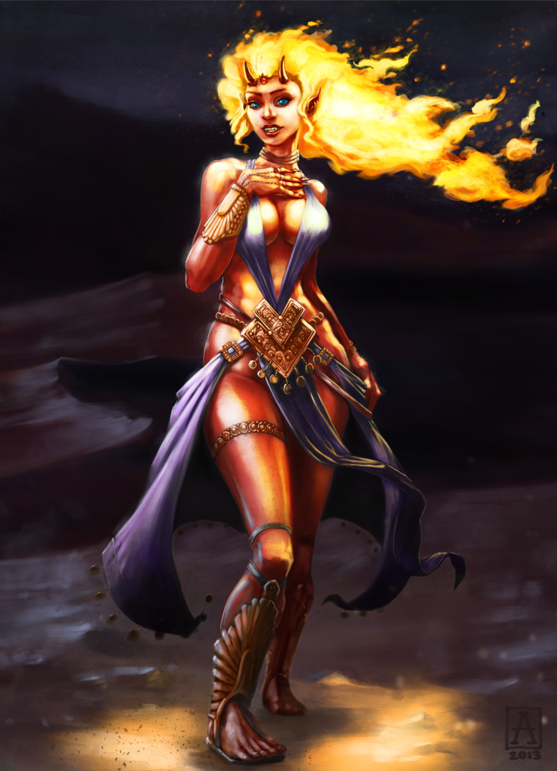
| Pira the Ifrit Sorceress |
The hair was fun and interesting to work on, but I realized as I began painting it that I'd failed to account for it as a light source in my drawing. So I had to re-work a lot of the lighting in the image.
In order to keep her clear and legible, I kept her face illuminated and didn't cast it into shadow. I think it's an acceptable compromise. The skin was also a real challenge. Painting red skin can be tricky, because while you want it to be red, you also want it to have depth of color and still be luminous, otherwise your character looks like a brick. And you don't want it coming out pink either. I ended up using a lot of orange, with green in the shadows to make the redness pop more on the lighted areas. Also some extra sharp highlights helped.
Meanwhile, I also got in on ConceptArt.org's ChoW (Character of the Week) contest. Participating in those is a great exercise and a wonderful opportunity to get feedback and encouragement from fellow artists. Unfortunately, ConceptArt has been going through some growing pains, and the server's been offline more than not recently.
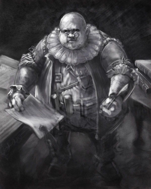
Anyway, the challenge theme was Fantasy Thief.
When I start thinking about a project, I often begin with the most ludicrous and annoyingly contrary idea from what my first reaction is. When I hear "thief", I immediately picture the standard "black cowl on the prowl". So instead, I took that idea and tried to do a 180-degree turn from it. I settled on the idea of the guy who sets up the heists, plans the job, forges the needed documents, etc. He's not dextrous or charismatic or even particularly sneaky looking. So here's The Fixer.
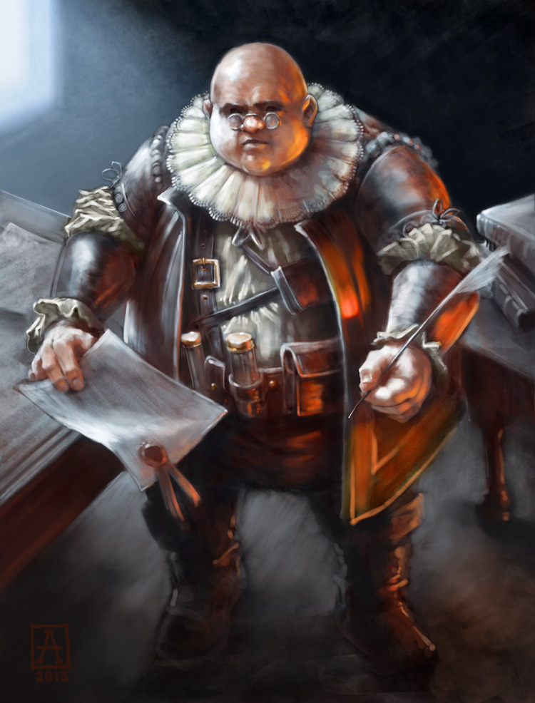 |
| The Fixer |
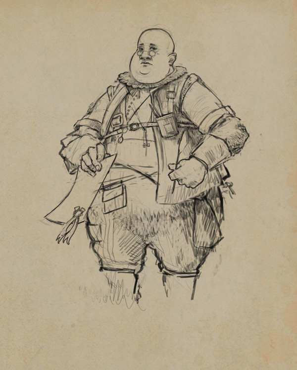 |
| fig. 1: The Fixer preliminary sketch |
 |
| fig.2: The Fixer, second revision |
 |
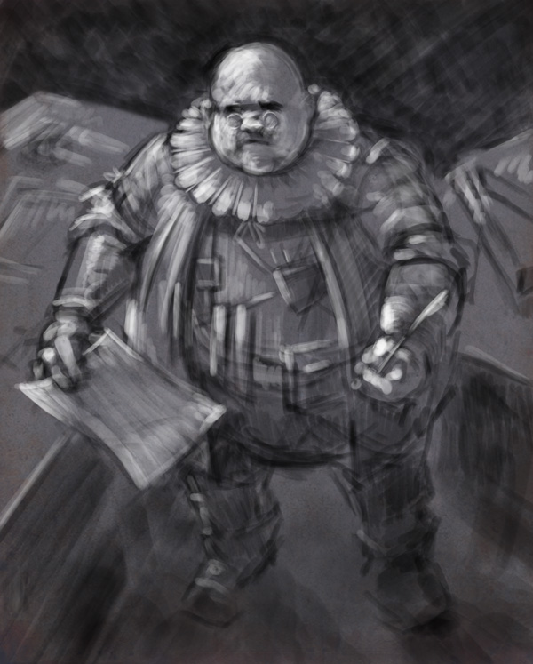
| fig.3: The Fixer, underpainting |
The final stages involved choosing the color scheme -- a cold blue light coming from back left, and a warm orange light from lower right. The contrast lends a nice air of intimacy and contrast. The colors were glazed on much like you'd do in oils, eventually building up to a more opaque finish in areas that needed it.
Great update, Nicholas!
ReplyDeleteLove the new art and the write-up.
The fixer is really awesome. Such a great character and by far the most interesting take on the topic in the challenge :)
Thanks mate! It was really fun to work on, and as usual, I learned a lot doing the challenge. I hope CA recovers from its own upgrading!
ReplyDelete