When I work, I'm frequently plagued by a lot of backtracking and second-guessing, and my process can be quite sloppy as a result. But with this recent piece, everything came together quickly and efficiently, so I thought it'd be a good idea to record my steps for posterity.
The piece was for a ConceptArt.com challenge title "Classic Fantasy Pinup", the idea being to depict a classic D&D fantasy female in a pinup pose. While my entry wasn't the best out there and didn't really push the envelope, I had a blast painting it.
I knew I wanted to do a cute goblin chick, since that in itself would be a bit outside the box. So I began by jotting down some thumbnail sketches.
The upper right one was starting to come together for me, but I began to feel that it wasn't sweet enough of a pose -- the "come-hither" look with a straight-on pose seemed more aggressive than I wanted. I also realized that my initial concept of having a very goblinoid face just doesn't fit the pinup bill. The rough pose on the bottom right started to remind me of some classic pinups, so I decided to roll with that, and cuting up the face.
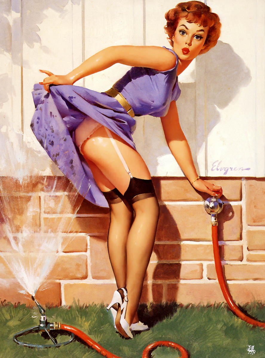
Next step was to do some research. I came across
this great Gil Elvgren piece and used that as reference for my next sketch. I was reminded also of the famous Coppertone ads with the girl getting her bikini bitten by a dog, and so added the weird little larva-puppy.
From there I took the sketch into Photoshop and set it on a Multiply layer at reduced opacity, and started doing some more decisive lines.
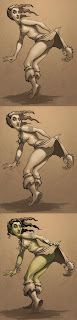
Once the basic lines were in place, I laid in some of the main shadow masses. I like to build up my shadows and my lights throughout the process, so at this stage they are still very faint.
My next step was to add a bit of texture to paint on. A blank white surface is really intimidating, so I like to add a texture to the background, something subtle without too much contrast. Once that's in, I can start to visualize the picture as a whole much better, and it also gives me more ability to push the shadows deeper and pull the highlights forward more. I also hit the background with a radial gradient to emphasize the light source, and began building up some highlights on the figure.
At this point, I decided her head was too small, which was making her look taller than a goblin should. I always picture goblins having big heads and big feet, so I scaled up both using Photoshop's Transform tool. I also decided to do the same for her ba-donka-donk so she'd have a bit more junk in the trunk: it's the focal point of the piece after all.
Time to add some more visual interest. On a separate layer I added some jewelry: I wasn't sure if I'd like it or if it'd come out right, so using a different layer for it really helped. For me, goblin jewelry is all about bones and rivets and leather and wood, so I start on a fingerbone armband and a tooth necklace.
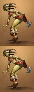
I find that when I'm painting details like this, I can lose sight of the roundness of the overall structure of the jewelry because I'm so focused on the little parts and pieces that make it up. Having the different pieces of jewelry on separate layers enabled
me to accentuate the way the various pieces wrapped around her wrists
and arms by making use of the Warp tool (Edit > Transform > Warp).
I also put some basic colors down on a separate layer set to Hue. Hue and Color layers are a great way to put down preliminary colors. Because they are on a separate layer, you can tweak them and experiment with color schemes before committing yourself. I often add several layers of color on top of each other, mimicking the real-world qualities of oil paint.
Once I got a general idea about the colors, I flattened my layers and began to blend and lay in more colors and highlights. This stage is the most painterly, since I'm working the entire image and looking at how it works as a whole. From here, it was pretty much adding some rimlights to sell the volumes, and calling it a day.