

Monday, December 30, 2013
Frost Giant Sketch
While reading Conan Volume 1 by Kurt Busiek & Cary Nord, I doodled this frost giant. Still loving the blue pencil!

Friday, December 27, 2013
Boxing Day Sketch
Something from yesterday. Non-photo blue pencil is a lovely way to begin a sketch: I see now why so many people swear by them.
 This is from a 9x12 ecru sketchbook with cold press paper, which provides some tooth. The initial figure pose was roughed out in blue pencil, which helped me "discover" where the pose should be. Then the darker lines went on top, finalizing "suggestions" made in blue. Darker lines are in my trusty Micron .5 HB lead technical pencil.
I found myself paying particular attention to how her gear wraps around her body, and focused a lot on edges of things. Edges are crucial, and I don't think that's stressed enough in art instruction. Where one thing meets another really defines the material and structure of the objects, establishes overlap and lighting direction, and describes form.

I found myself paying particular attention to how her gear wraps around her body, and focused a lot on edges of things. Edges are crucial, and I don't think that's stressed enough in art instruction. Where one thing meets another really defines the material and structure of the objects, establishes overlap and lighting direction, and describes form.
Monday, October 28, 2013
Rotting undead sketch


One of the pitfalls of working digitally is the ability to endlessly revise and second-guess. This can lead to endless hours of noodling. Beginning on paper can help start you off focused: you commit to decisions -- good or bad -- and follow through, because it's more difficult to alter than a purely digital image. Of course, once you get something down in pencil and scan it in, it's easy to revise, but some of that initial commitment remains I think.
In any case, I'm sometimes surprised at how many alterations I make to sketches!
Tuesday, October 22, 2013


Sunday, May 19, 2013
Character Building
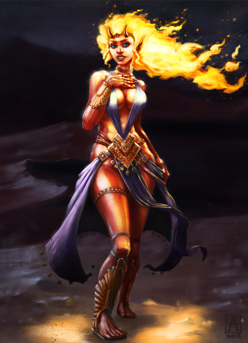 |
| Pira the Ifrit Sorceress |
The hair was fun and interesting to work on, but I realized as I began painting it that I'd failed to account for it as a light source in my drawing. So I had to re-work a lot of the lighting in the image.
In order to keep her clear and legible, I kept her face illuminated and didn't cast it into shadow. I think it's an acceptable compromise. The skin was also a real challenge. Painting red skin can be tricky, because while you want it to be red, you also want it to have depth of color and still be luminous, otherwise your character looks like a brick. And you don't want it coming out pink either. I ended up using a lot of orange, with green in the shadows to make the redness pop more on the lighted areas. Also some extra sharp highlights helped.
Meanwhile, I also got in on ConceptArt.org's ChoW (Character of the Week) contest. Participating in those is a great exercise and a wonderful opportunity to get feedback and encouragement from fellow artists. Unfortunately, ConceptArt has been going through some growing pains, and the server's been offline more than not recently.
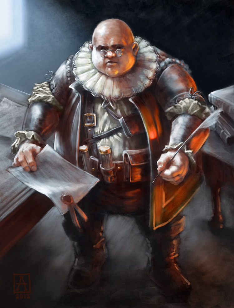
Anyway, the challenge theme was Fantasy Thief.
When I start thinking about a project, I often begin with the most ludicrous and annoyingly contrary idea from what my first reaction is. When I hear "thief", I immediately picture the standard "black cowl on the prowl". So instead, I took that idea and tried to do a 180-degree turn from it. I settled on the idea of the guy who sets up the heists, plans the job, forges the needed documents, etc. He's not dextrous or charismatic or even particularly sneaky looking. So here's The Fixer.
 |
| The Fixer |
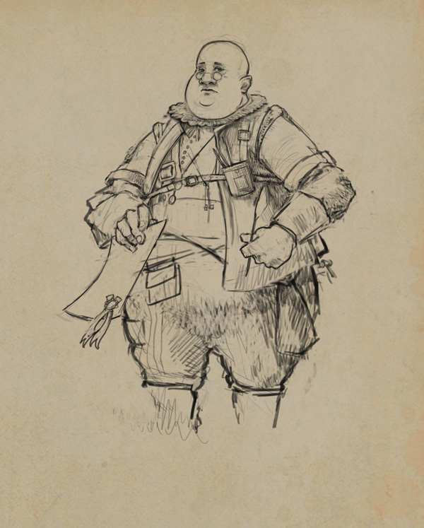 |
| fig. 1: The Fixer preliminary sketch |
 |
| fig.2: The Fixer, second revision |
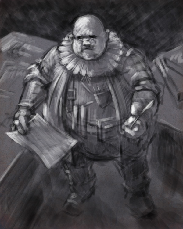
 |
| fig.3: The Fixer, underpainting |
The final stages involved choosing the color scheme -- a cold blue light coming from back left, and a warm orange light from lower right. The contrast lends a nice air of intimacy and contrast. The colors were glazed on much like you'd do in oils, eventually building up to a more opaque finish in areas that needed it.
Saturday, April 13, 2013
Character Commission: Pira
Here's a nearly-complete greyscale for a commission I'm working on.

I'm really holding myself back from adding color, and trying to get the thing as complete as possible before adding color. I don't normally work that way: it's usually a much more chaotic process. But being able to just focus on values, anatomy, and costume design without fretting over color certainly makes this part a lot easier. My fear now is that as I add color I'll end up painting over everything.

I'm really holding myself back from adding color, and trying to get the thing as complete as possible before adding color. I don't normally work that way: it's usually a much more chaotic process. But being able to just focus on values, anatomy, and costume design without fretting over color certainly makes this part a lot easier. My fear now is that as I add color I'll end up painting over everything.
Tuesday, April 2, 2013
Big Red
Here's the final image.
 |
| Big Red |
"After many years of pillage and carefree overindulgence, her successes and excesses began to take their toll. And despite her unmatched skill in combat, there was one foe that she could never manage to defeat: her weight. Eventually people stopped calling her Red Sonja altogether, and simply referred to her as Big Red."
Tuesday, March 26, 2013
Big Red Desktop
A progress shot of Big Red, a piece for the IFX Monthly Challenge. Weird. She looks a bit like Roseanne Barr to me. Anyway, I wanted to post a shot of it before I inevitably screw it up.
 |
| Big Red progress. |
Sunday, March 17, 2013
Halfman!

Friday, March 15, 2013
King of Clubs
 |
| Goblin King of Clubs. |
While doing a little research, I learned that the suits represent the 4 castes of medieval society: Spades is Nobility, Hearts is Clergy, Diamonds is Merchant, and Clubs is Peasant. Armed with this tidbit, I decided that using a goblin to represent the peasant class would be sort of fun, if a bit elitist. (Sorry peasants!)
I also got hung up on the idea of a meat crown, so that happened.
Subscribe to:
Posts (Atom)