Monday, December 10, 2012

Old Cardboard Miniature Art

Back in my college days, we were all too poor to afford decent miniatures for our RPG game. We used whatever we could, and -- being an art student -- I was tasked with making some minis. For some unknown reason, in the intervening twenty years, those cardboard minis got stored away with my Christmas decorations. I see them every year, and go "Oh, look at these!" then put them away again 'til next year.

But this year I took 20 minutes to photograph them, and I now post them here for your viewing amusement.

As you snicker, bear in mind that these were created by hand with a finepoint pen, and each is no larger than about 1 inch high.

Minis shown at scale

Collected minis, mostly by me, circa 1991. (The cardinal, second from left on top row, and the lizard man at bottom were by my friend Matt; Princess in the doorway on row three, the juggler, and the horned hag were done by my lovely wife.)
They were a blast to do, trying to come up with generic characters that would still have some personality readable at a small scale.

Saturday, August 11, 2012

Harley Quinn

Yeesh. It's been a while since I posted here. I've got several things in progress, but here's some fan art of Harley Quinn that I finished a few weeks ago. It started with a desire to do a very exaggerated pose, and ended up as this semi-pornographic version of Ms. Quinn.

Harley Quinn: pre-New 52, post clothing.

Meanwhile, it's been a hectic summer so far, featuring two extremely important changes in my life. First, I switched over to a Mac. Second, I'm reading James Gurney's Color & Light for the Realist Painter. If you are familiar with either, then you know what I'm talking about. And while running out and switching to a Mac is a major financial hurdle, picking up a copy of Color & Light isn't, so if you don't already own it, go get it.

Saturday, June 30, 2012

Orc Shaman

An orc shaman that I'd been noodling around with.
I had a lot of fun on the outfit for this guy, what with the antlers and boar's head spaulder. I also wanted to give him an offbeat weapon, rather than the de rigeur staff. From what I understand, it takes a lot of skill and finesse to properly manage a staff, and I figured any self-respecting orc would want something a little more visceral. Hence the shillelagh.
He also wears the rondels of fallen foes on his belt, and has some weird levitating mystical rock always hovering over his head. What's up.

Sunday, June 17, 2012

Sketches: Monster & Cavalry Officer

Quick sketch of a cavalry officer in Photoshop. About an hour and a half.


I started by using a toned background, then laid out some general shapes on a new layer. When I was ready to commit more fully, I reduced the opacity of that layer to about 15%, then set up a new layer for black lines on top. When I was ready for highlights, a created another Solid Color layer (bluish white) and handled it the same way.

All my drawing layers were done in Solid Color adjustment layers: pick a color for the Solid Color layer that you want your lines to be (nearly black, in this case) and then fill the mask with black, making that color disappear. Now when you draw on the mask with white, you produce black lines. I've got my stylus set up to switch colors when I press the button, so this works well for me: I just draw using white, then toggle to black when I need to erase. No fumbling around with the stylus or the keyboard.


I stayed up a bit later and did this guy, starting the same way as above, then adding color slowly, trying to retain the textures beneath. 


Wednesday, June 6, 2012

Wednesday, April 25, 2012

Tarra's Scary Friend Beast - Complete

I realized I never posted up the final piece that I referenced in my last post. So here it is, for posterity's sake.
Tarra's Scary Friend Beast

Saturday, March 31, 2012

Tarra's Scary Friend Beast

Here's a detail of the thing I've been working on for the IFX monthly challenge for March.

Sunday, March 25, 2012

Ivana Blastoff: Russian Rocketgirl


Here's a picture I did for ImagineFX's weekly illustration challenge. The theme this week was "Rocketgirl Rita, the quintessential 50's sci-fi pinup girl." Despite being well received, I think my entry strayed a bit from the theme, but what the hey.

Fig. 1: Rough thumbnail

Because I like pinups to be both funny and sexy, I hit on the idea of a girl helplessly riding a rocket into space. So I scrawled the idea down. (Fig. 1)


Fig. 2: Refining the pose.

Next I pushed the initial sketch back to about 20% and worked on top, refining the pose a bit. (Fig. 2) I was trying to sell the idea of her hanging on to the rocket, and express some anxiety about falling off.


Fig. 3: Preliminary color

After that, I started refining the anatomy and adding some preliminary color. (Fig. 3) This can be a tough stage, trying to get some colors that work together, but in this case it seemed pretty simple: I knew I wanted a military green for her clothes, with some red accents, and a sky background. I also trimmed her badonk a bit, because it was looking just too massive. I also made her arms straighter, increasing the tension of the pose. I found this helped make her look like she is trying to hang on, rather than just riding the rocket.

Fig. 4: Clouds.


Next (Fig. 4) I added some clouds on a masked layer, using two different cloud brushes. I basically ran them in a diagonal, then used a distortion filter to make them look like they are curving off along the Earth's horizon. I also put some shine to the rocket, again using a masked layer to keep the edges crisp even while using huge Overlay strokes. The Overlay brush mode does really cool things with colors, and I got a nice sheen to the rocket this way. I also perked up her left breast a bit.


Fig. 5: Rocket exhaust

After that I added some modeling to her clothes and hair, and began building up the rocket's fiery exhaust. (Fig. 5) For that I used a brush comprised of random-looking dots, building up in several layers in various modes (Overlay & Screen mostly). I hit the resulting dots with a motion blur filter, and did that a few times, building up color & layering.


Fig. 6: Textures & details.

Next (Fig. 6) I added some more highlights from the sky, and hit her with the glow from the engine. I also put a nice radial gradient glow around the flames, again set to Overlay, and added a texture overlay to the rocket. In addition to coloring the helmet and adding the dome, I vignetted the entire piece by using a blue color fill layer set to Multiply, then knocked down the opacity and masked off the center with a radial gradient on a mask. I feel like this really helped tie together all the colors & elements in the picture, reinforcing the focus on the subject.


To finish up, I knocked back some of the rocket texture because it was reading more sharp than anything else in the picture -- too photographic. I also softened the rocket's edges and added the stars & reflections on the helmet. Also, someone suggested I make her hair on the same angle as the rocket exhaust -- a great idea, since the color I chose for her hair was meant to emulate the fiery rocket color. A bit more color saturation and level adjustment and I called it done.


Monday, March 12, 2012

Skeleton Warrior

A little black & white test image that I thought came out nifty, especially on that groovy neutral background.

Monday, January 23, 2012

Frog Connoisseur: Process

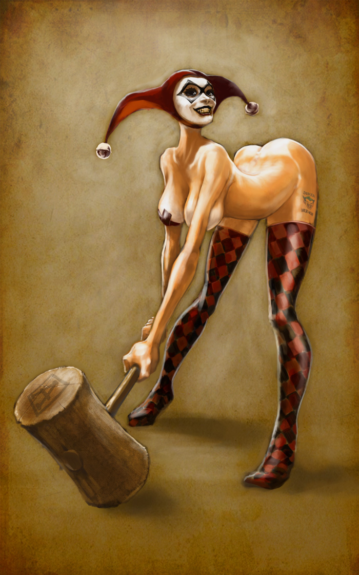
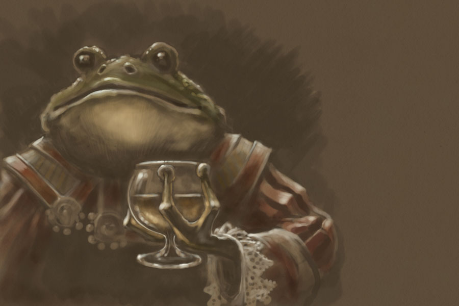
A good friend of mine made a suggestion for a painting last night, and it stuck with me today, so I took it on, coming up with the following image.


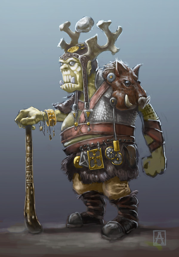
He's an emissary for a powerful witch from a game my friend put together. He used to be the avatar of a water deity, but the deity became more powerful replaced this guy with a bigger and better avatar. Having nowhere else to go, he wandered into the witch's realm, and she gave him a nice cushy job.

The results came together with strangely effortless speed, going from an initial sketch to a final piece in a matter of a few hours. I was so happy with my process and how well it worked to nail the image, I decided to outline it here. So here's a fairly detailed explanation of the process I used, most of which is becoming standard procedure for me.

First I consulted a couple of Googled frogs & toads for reference, and started the initial sketch.

For the sketch or under-drawing, I lay down a dark background with a bit of texture, usually a scanned paper texture, just to provide some tooth and roughness. Above that, I create a dark Solid Color Adjustment layer. This will be the lineart layer. It's nice to have it as an adjustment layer because if I want, I can easily change the color of the lines and see the results in real time.

Next, I mask the layer completely (so none of the color shows) and then draw on the mask using black and white. Because I have my stylus set up to flip between fore-and background colors, I can draw and erase without having to call up the eraser tool or flip my stylus upside-down. A click of the stylus button gives switches me between adding to and subtracting from the mask, thus effectively erasing or creating a mark.

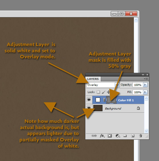
Fig. 1: Detail of the Solid Color Adjustment layer 
This time, however, I used a masked Solid Color Adjustment layer for my lineart layer as usual, but instead of masking it completely, I filled the mask with a 50% gray and set the color of the layer to white. I then set it to Overlay mode, and went with a much darker background layer than usual. So now the lineart layer is initially lightening the background some: the white is overlaying the dark background, but because it is masked with a 50% gray, it isn't fully bleaching the layer, resulting in a good neutral tone. (See Fig. 1 for details!)

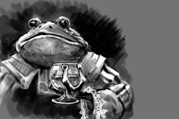
Fig. 2: Lineart layer mask.
Why this convoluted setup? When drawing on the mask this way, I don't get just black lines. I can switch between black and white on my stylus button to get either a dark line or a light line, essentially drawing in lights and darks on the same isolated layer. And because it's an Overlay layer, the line art remains in harmony with the underlying background color.

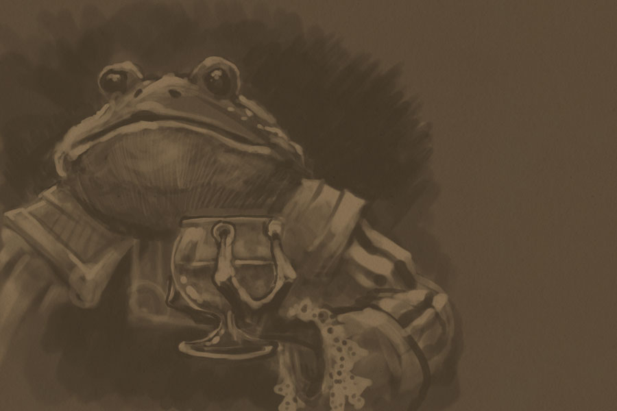
Fig. 3: The drawing or lineart  layer.
Figure 2 shows a screen shot of the actual mask channel for the lineart layer. Note that there is a broad range of tones from black to white in the mask. This was drawn directly into Photoshop, but a similar method could be used by scanning a toned drawing in and using it as a mask in the lineart layer.

Figure 3 shows what the drawing looks like as I'm working on it. Note that the lights and darks are much less stark than they appear in the mask. I like this because it gives me somewhere to build up from, and thus allows me to focus highlights and shadows with more precision later on.

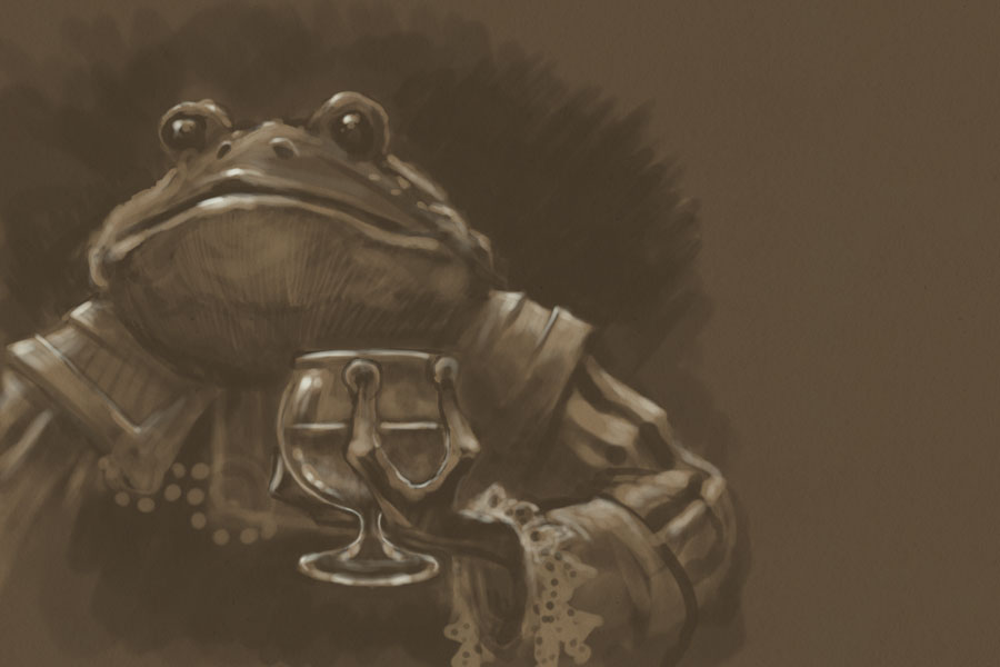
Fig. 4: Beginning to push and pull
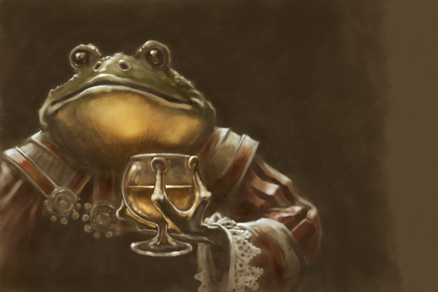
At this point, I'm ready to start a new layer, painting in stronger highlights and deeper shadows. Figure 4 shows the beginnings of this stage. I can see now where I want the most focused lights, accentuating the mouth and glass, with secondary focus on the shoulders and arm.

Fig. 4: Timid color.
Figure 4 shows the timid initial foray into adding color. I usually do this step on Overlay or Soft Light layers, allowing me to slowly build the colors in washes. Taking such a restrained approach keeps some of the background showing through the color, guaranteeing more color unity throughout the piece. It's an approach that's similar to the glazing techniques of old master oil painting.

Fig. 5 : Bolder color.
At this point, I'm getting ideas about where I want the strongest colors, and I go ahead and add richer washes on Overlay layers, pushing the shadows further back and pulling the lights more forward. I also start adding more opaque colors to reinforce those washes, as seen in Figure 5.

After this it was a matter of doing a final detail pass to tighten up a few bits that needed it, then tweaking the Levels and Saturation before saving out the final piece above.

If you've read this far, I hope you got something out of this process analysis. And thanks for reading!