

Friday, December 30, 2011
Vampire Girl


Thursday, December 15, 2011
And Also a Dragon

I'm not sure if this is the final draft, but I thought I'd share.
This came out of a quick warmup sketch that turned into a full-blown painting before I knew what was happening. About 6 hours over two nights. I wanted to create a classic dragon, ruthlessly evil, winged, and generally unpleasant. And with articulate hands. Dragons need hands.

The sketch started very rough. I then tried to exaggerate the original stance I'd drawn by placing the legs further apart, suggesting weight. Some highlighting and deepening of shadows came next. I also refined the neck, making it a bit more sinuous, and elaborated on the back foot.
 The piece up until now had been created on a few layers: one for the darks, and another for the highlights, all against a textured paper background. I've been using a method whereby I draw on an Adjustment Layer mask, so the line art is revealing a color beneath. It's an easy way to adjust the color of the line art on the fly.
At this point, I placed a weird orange to turquoise color gradient below the line art, again in an Adjustment Layer. This allowed me to tweak the gradient in real-time, and see the results as I adjusted. When I got some colors I liked, I started painting in opaque layers on top of the whole deal, eventually flattening everything and adding more layers on top as I refined areas like the head, wings, claws and flames.
For most of the picture, I used a textured brush that I got from somewhere -- most likely an IFX disk. I was paying attention to focus in this one, hence the brushy areas juxtaposed against the detailed ones.And I tried to really nail down three distinct light sources: the ambient greenish sky lighting, the uplight from the flames, and an unlikely but effective spotlight directly above the dragon.
Tuesday, December 13, 2011
Steampunque Project
A little while back I was contacted by the creator of a great little iPhone app called StampArtFever. The concept is essentially digital stamp collecting, allowing users to buy, swap for, bid on, and hunt down rare stamps to complete sets created by a single artist. Many of the stamps are lovely, using artwork either commissioned or leased by the game's creator, which makes the game a real treat.
So I was pretty excited when he contacted me and tapped me to do a few pieces based in the steampunk world of The Robber Baron painting I did a while back. I already had a few characters floating around in my cranium, so it was with great pleasure that I took up my stylus and got cracking.
Here's a preview of one of the characters, The Tinker.
Nailing down a design for this dude was tough. The other three characters arrived pretty quickly, but this guy took a while. I knew I wanted someone who wasn't particularly heroic -- really just a professorial guy who makes cool gadgets for the government, and has since gone on the lam.
I eventually got some solid line art down for the pose and face, with a few suggestions of the gun and shoulder piece. After that I did a lot of slow form-finding for the equipment by scribbling in and erasing out until things started to happen. From there I started building up washes of color and solidifying the forms.
I'll try to post a few more updates as things progress, but in the meantime, check out StampArtFever. It's free for the iPhone/iPod, or a whopping 99 cents for the hi-def iPad version.
So I was pretty excited when he contacted me and tapped me to do a few pieces based in the steampunk world of The Robber Baron painting I did a while back. I already had a few characters floating around in my cranium, so it was with great pleasure that I took up my stylus and got cracking.
 |
| The Tinker. |
Nailing down a design for this dude was tough. The other three characters arrived pretty quickly, but this guy took a while. I knew I wanted someone who wasn't particularly heroic -- really just a professorial guy who makes cool gadgets for the government, and has since gone on the lam.
I eventually got some solid line art down for the pose and face, with a few suggestions of the gun and shoulder piece. After that I did a lot of slow form-finding for the equipment by scribbling in and erasing out until things started to happen. From there I started building up washes of color and solidifying the forms.
I'll try to post a few more updates as things progress, but in the meantime, check out StampArtFever. It's free for the iPhone/iPod, or a whopping 99 cents for the hi-def iPad version.
Tuesday, August 16, 2011
Marker Brush
I should be less random about posting here. Alas!
 Taking inspiration from Bobby Chiu's recent Fairy Tales Reimagined contest, I started up a new project. I'd had a few ideas rattling around for Snow White and the Seven Dwarves as a classic D&D adventuring party, with each one taking on a distinctive character class. I'd already gotten some ideas down for Snow White herself (as a ranger, since she's like friend to all the animals) but needed to generate some dwarves quickly. So I cranked out a few thumbnails using my new brush.
I dig this new brush. And it's so simple. It's basically just a square brush tweaked to work like a design marker. (Opacity 15%; Shape Dynamics- Size Jitter: Pen Pressure, 34% minimum diameter; Angle Jitter: Direction; Smoothing on.)
 Working fast and loose in black &
white over a simple gray textured background, I've gotten some results I
really like. The tones build up nice and slow with those settings, and
the rough squareness of the brush keeps me from getting too fussy early
on. It's all about blocking in shape and tone, without stressing over
details too much.
Working fast and loose in black &
white over a simple gray textured background, I've gotten some results I
really like. The tones build up nice and slow with those settings, and
the rough squareness of the brush keeps me from getting too fussy early
on. It's all about blocking in shape and tone, without stressing over
details too much.
I took the Druid guy and worked him up more, again starting with the marker brush, just with a much larger canvas size. After a while, I began to refine with some more traditional brushes. There's a lot of tonal layering going on, working up shapes and slowly refining, which seems to be working out well for me. There seems to be something about the very quick and gestural start, followed by a slow, methodical period of refinement that seems to suit me well so far.
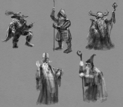 Taking inspiration from Bobby Chiu's recent Fairy Tales Reimagined contest, I started up a new project. I'd had a few ideas rattling around for Snow White and the Seven Dwarves as a classic D&D adventuring party, with each one taking on a distinctive character class. I'd already gotten some ideas down for Snow White herself (as a ranger, since she's like friend to all the animals) but needed to generate some dwarves quickly. So I cranked out a few thumbnails using my new brush.
I dig this new brush. And it's so simple. It's basically just a square brush tweaked to work like a design marker. (Opacity 15%; Shape Dynamics- Size Jitter: Pen Pressure, 34% minimum diameter; Angle Jitter: Direction; Smoothing on.)
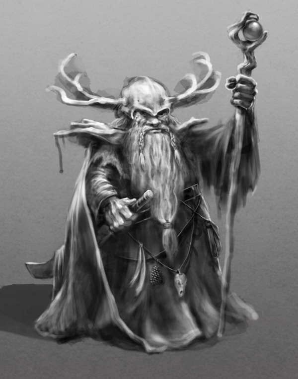
I took the Druid guy and worked him up more, again starting with the marker brush, just with a much larger canvas size. After a while, I began to refine with some more traditional brushes. There's a lot of tonal layering going on, working up shapes and slowly refining, which seems to be working out well for me. There seems to be something about the very quick and gestural start, followed by a slow, methodical period of refinement that seems to suit me well so far.
Subscribe to:
Posts (Atom)